http://learn.shayhowe.com/html-css/opening-the-box-model/
Box Sizing
Until now the box model has been an additive design. If you set the
width of an element to 400 pixels and then add 20 pixels of padding and a border of 10 pixels on every side, the actual full width of the element becomes 460 pixels. Remember, we need to add the width, padding, and border property values together to get the actual, full width of an element.
The box model may, however, be changed to support different calculations. CSS3 introduced the
box-sizing property, which allows us to change exactly how the box model works and how an element’s size is calculated. The property accepts three primary values—content-box, padding-box, and border-box—each of which has a slightly different impact on how the box size is calculated.Content Box
The
content-box value is the default value, leaving the box model as an additive design. If we don’t use the box-sizing property, this will be the default value for all elements. The size of an element begins with the width and height properties, and then any padding, border, or margin property values are added on from there.1 2 3 4 5 6 | div { -webkit-box-sizing: content-box; -moz-box-sizing: content-box; box-sizing: content-box; } |
Padding Box
The
padding-box value alters the box model by including any padding property values within the width and height of an element. When using the padding-boxvalue, if an element has a width of 400 pixels and a padding of 20 pixels around every side, the actual width will remain 400 pixels. As any padding values increase, the content size within an element shrinks proportionately.
If we add a
border or margin, those values will be added to the width or heightproperties to calculate the full box size. For example, if we add a border of 10 pixels and a padding of 20 pixels around every side of the element with a width of 400pixels, the actual full width will become 420 pixels.1 2 3 4 | div { box-sizing: padding-box; } |
Border Box
Lastly, the
border-box value alters the box model so that any border or paddingproperty values are included within the width and height of an element. When using the border-box value, if an element has a width of 400 pixels, a padding of 20pixels around every side, and a border of 10 pixels around every side, the actual width will remain 400 pixels.
If we add a
margin, those values will need to be added to calculate the full box size. No matter which box-sizing property value is used, any margin values will need to be added to calculate the full size of the element.1 2 3 4 | div { box-sizing: border-box; } |
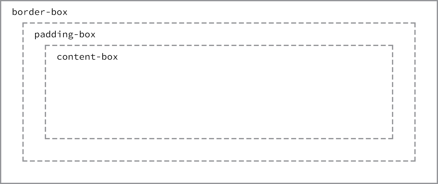
Different box-sizing values allow the width of an element—and its box—to be calculated from different areas
Picking a Box Size
Generally speaking, the best
box-sizing value to use is border-box. The border-box value makes our math much, much easier. If we want an element to be 400 pixels wide, it is, and it will remain 400 pixels wide no matter what padding or border values we add to it.
Additionally, we can easily mix length values. Say we want our box to be
40% wide. Adding a padding of 20 pixels and a border of 10 pixels around every side of an element isn’t difficult, and we can still guarantee that the actual width of our box will remain 40% despite using pixel values elsewhere.
The only drawback to using the
box-sizing property is that as part of the CSS3 specification, it isn’t supported in every browser; it especially lacks support in older browsers. Fortunately this is becoming less and less relevant as new browsers are released. Chances are we’re safe to use the box-sizing property, but should we notice any issues, it’s worth looking into which browser those issues are occurring with.
No comments:
Post a Comment